Typographic Scales
Consistent typography using simple mathGetting Started
What is a typographic scale?
A scale in the traditional sense is a ratio of relative value between two objects.
In mathematics, a scale is precise and enables you to quickly deduce the value of a given number by knowing its position on the scale and the ratio between one position and the next.
In music, a scale helps a group of performers stay in the same key and consistently play notes that are harmonious with each other.
Typographic scales are much the same. They provide consistency, rhythm, hierarchy, and contrast because they are predictable. A well-defined scale helps users understand your content better, speeds up a product development cycle, and even helps to reduce technical debt.
In her seminal work, Thinking with Type, Ellen Lupton defines scale as “the size of design elements in comparison to other elements in a layout as well as to the physical context of the work.” She goes on to add that “Scale is relative… Designers create hierarchy and contrast by playing with the scale of letterforms. Changes in scale help create visual contrast, movement, and depth as well as express hierarchies of importance.”
Choose wisely
Historically, a mechanical typesetter’s scale was determined by the physical properties of the fonts they owned. In printing presses, a font - a specific typeface set at a specific size - was made of lead and a printer had to own an entire copy or even multiple copies of the font, along with custom characters and lead pieces for spacing to be able to typeset a document. Ultimately, the type foundry who created a given font determined the scale that could be used by printers. Eventually, typewriters became the dominant method of setting type and the majority of typewriters only had one font size so scales were even further constrained.
In digital typesetting, we have effectively unlimited font sizes and the range is constrained entirely by a designer’s judgment of what is practical for a given application rather than the physical properties of a font. This gives us the ability to endlessly customize our type usage to suit users’ needs or the visual effect we are trying to achieve.
This customizability makes choosing a consistent scale much more important - and complicated.
Considerate typography
Typography is all about meaning. When we use consistent patterns in design - typography or otherwise - it helps users understand the content and how to use it. Like most components in a visual design, setting type for usability and visual appeal requires consideration of more than just the font size used. A well-designed scale sets consistent rules, establishes hierarchy and rhythm, makes a body of text more readable and legible, and is responsive to suit the different devices it may be consumed on.
Consistency is one of the most fundamental values in design. Consistency sets up expectations for users about how a product works. It guides them through structured information and communicates behavioral patterns. Consistency is also helpful on the product development side. When thoughtful patterns are used, developers and designers can communicate with each other more effectively, arbitrary “magic numbers” disappear, codebases become more manageable, and development time decreases. This is the underlying principle behind the popularity of design systems and style guides.
Hierarchy is the order of importance of a set of visual elements. A proper hierarchy uses a varying range of contrast through type size, color, weight, etc. to set elements apart from each other so the reader can easily understand the structure of a document.
Measure is the length of a line of text. If a line of text is too long or too short it can make it difficult for a reader to follow a thought from one line to the next. If it’s too long, they might misjudge which line comes next. If it is too short, a thought may take several lines to complete and become more difficult to understand. A good general guideline is a measure of 45-75 characters with 66 characters being ideal.
Rhythm is the concept that elements should align with each other consistently. Determining a vertical rhythm - generally defined by a baseline grid - makes a design appear more thoughtful, predictable, and intentional.
Responsiveness is the idea that text should resize and reflow to fit the medium on which it is being consumed. A phone’s small width relative to a desktop computer may mean that the font size needs to increase to be more legible or decrease in order to make the measure more comfortable for readers. Headings may need to shrink to fit on the screen and pull quotes may need to become larger to maintain their importance.
Breaking the scale
Scales occasionally need to be broken for a specific purpose, usually visual rather than functional. Examples like marketing sites, editorial design pieces, or advertisements may require type that extends beyond your scale. Don’t expand your scale to fit these edge cases as that leads to sloppiness and bloat. Let them set and follow their own internal logic or create a separate set of rules to be applied at the brand level rather than the product level.
Defining a typographic scale
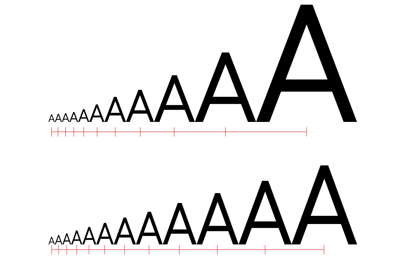
Modular scale
A modular scale is a scale with a single base that follows a single ratio. Robert Bringhurst’s modular scale may be the most well-known example of a typographic scale. It was used by European typographers who were working with lead type and referred to the sizes in terms like “pearl” (5pt), “minion” (7pt), “pica” (12pt), and “english” (14pt). He refers to this as the equivalent of a Diatonic Scale in music. Many other typographers since have derived their modular scales from musical ratios such as “Minor Second”(1.067), “Major Third” (1.25), and “Perfect Fifth” (1.5).
Modular Scales are simple and consistent because they are defined by a single multiplier, but they can lead to messy, hard-to-remember number values (e.g. a base size of 16px multiplied by the Golden Ratio (1.618) leads to a secondary value of 25.888px), so depending on the unit of measurement you choose to use, you might choose to round your values to integers.
Responsive scale
A responsive scale provides optimized values for different classes of device. A large heading on a smartphone might push the rest of the content off the screen, so choosing a lower ratio there will reduce contrast, but make it more usable. So, if your base is 16px and your scale is 1.5 but you find yourself running out of space at small sizes, consider decreasing the base size or lowering the ratio and using font weight to provide contrast.
Platform defaults
Some platforms, like iOS and Android, have their own recommended scales. The logic in their scales may not be apparent, but there are often additional benefits to using these scales such as built-in accessibility features, simplicity of implementation, and fitting in with the rest of the system.
Defining your own scale
If the defaults don’t work for you, there are a few things to consider when generating your own scale.
First, do you plan to use a baseline grid? If so, that gives some clear constraints about how you should choose your ratio as well as how you should set your leading in order to establish vertical rhythm. For example, if you plan to use a 4pt baseline grid, you’ll want the sum of each interval’s size and leading to be equal to an even multiple of 4.
Second, do you plan to use multiple font weights and variants to create contrast? If so, using a smaller ratio will make your scale more versatile with less effort. For simple content, you could even get away with a single font size and communicate your hierarchy through italics, bolding, and capitalization.
Tips + Tricks
Keep it simple
HTML has a pretty flexible solution which consists of only seven steps by default - a body size and six headings. A structure like this will keep excess styling and code bloat to a minimum, though a responsive scale may need multiple values for each interval to support multiple device sizes.
Choose your typefaces first
Knowing which typefaces you’ll use and understanding their metrics will help you pick a scale that will suit your type choices. Script typefaces may require more leading to allow for long, sweeping ascenders and descenders. If you’re using caps or narrow typefaces, you may need to adjust the size to allow for more legibility or prevent your characters from becoming too dense.
Content > brand
If your product is content-focused, your type decisions should be too. Many designers opt for type that fits their brand better than their content. Don’t make that mistake. Start with the system defaults for whatever platform you’re building on and adjust if necessary with the understanding that you will be losing time in implementation, built-in features, and even performance.
Copyright 2026 Spec Network, Inc.