The 8-Point Grid
Using multiples of 8 to define dimensions, padding, and margin of elements.Before you start
This guide is meant to help designers lay out UI quickly and consistently. It’s particularly helpful for designing mobile app UI where there are fixed constraints, though I find it useful for responsive web design as well.
As with many design guidelines, the examples may be more helpful while designing than read independently.
Getting Started
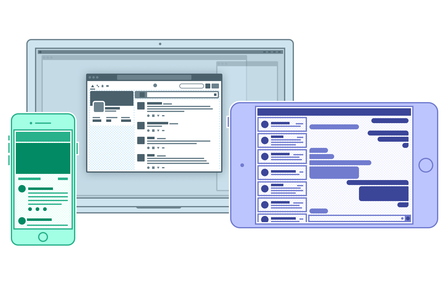
Code > Mockups
Design apps and prototyping tools allow you to create fantastical visions of what UI could look like. But when it comes to digital product design, a mockup or prototype’s sole purpose is to clearly communicate a proposed solution to stakeholders and developers. In the end, only what a developer can reproduce in code (in combination with assets) can make it to production.
Now, almost anything you can make in a design tool is possible to create in code, but there are several reasons — ranging from usability to launch timelines to performance issues — that a design might not be practical to build.
What matters most is how your designs behave in code on a user’s device, so prioritize reducing time between ideation and programming over perfect layout in Sketch or Photoshop wherever possible.
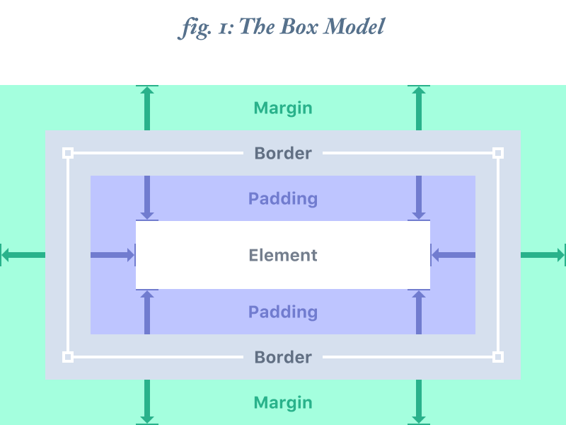
The Box Model
The Box Model is a way to describe an object’s dimensions and spacing. It consists of 4 components: border, margin, padding, and the dimensions of the element itself.
Border: the thickness of the stroke around the edges of an element. Most design tools do not allow this to affect overall spacing and dimensions.
Padding: the space between the bounds of an element and its child elements
Margin: the space between the bounds of an element and neighboring objects
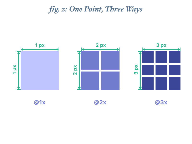
What are points?
A point (pt) is a measurement of space that is dependent on screen resolution. The simplest explanation is that at a “1x” resolution (or @1x), 1pt = 1px.
At a “2x” resolution (@2x), 1pt = 4px because resolution doubles on both the X and Y axes making it 2px wide by 2px tall.
At a “3x” resolution (@3x), 1pt = 9px (3px x 3px) and so on.
@1x
Please note that everything here is designed “@1x”. Assets for @2x, @3x, and all other variations can more easily be derived from @1x assets than from designs created at a multiple thereof.
For example, to get clean assets from an @2x design to an @3x design (assuming an even-number line thickness), you’d need to scale the artwork to 50% of its original size (down to @1x) and then scale the resulting artwork to 300%.
@1x designs on the other hand can easily be scaled cleanly to any integer multiple - @2x, @3x, @4x, etc.
It’s possible to add more detail to icons and fine assets by working at each individual resolution, but the opportunities to do so are relatively uncommon. In most cases, it’s ideal to work @1x for speed and convenience’s sake.
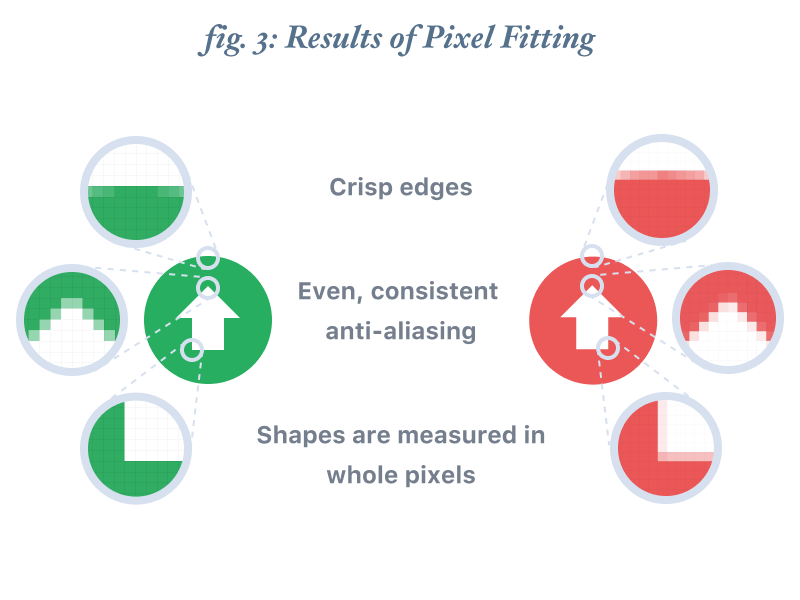
Using the pixel grid
Every UI element you create should be aligned to the pixel grid. This is a concept known as pixel-fitting and it ensures that all of your elements appear crisp and well-defined on a user’s device.
Text is somewhat of an outlier here as the unique metrics that allow your eyes to read letters clearly require a little bit of the anti-aliasing that makes other shapes blurry. So, don’t worry about every point of your letters aligning to the pixel grid.
Text elements
Inline elements like text are almost always the most important part of a given interface, yet things like text sizes and line-height don’t always conform easily to the same UI grid as other elements while maintaining vertical rhythm and legibility.
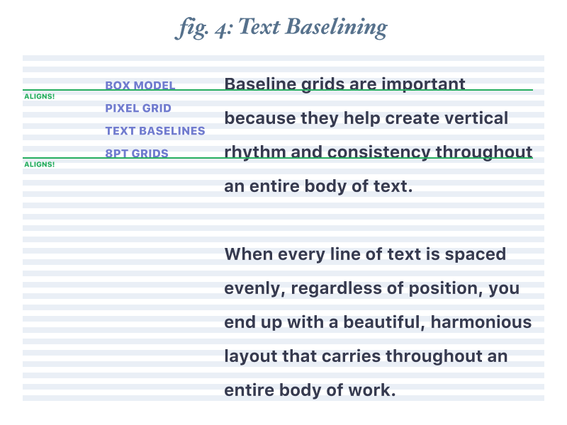
Baselining your text is a great tool for developing vertical consistency in your designs. By positioning the baseline of each line of text onto evenly-spaced lines, you can easily bring all of your UI elements into a harmonious vertical rhythm.
I like to combine my 8pt UI grid with a 4pt baseline grid. This pairing keeps the math simple and clean while providing sufficient options to fit a variety of text styles.
Most platforms have some guiding principles for what the basics should be, but breaking from default typefaces can cause unique outcomes, so use discretion when laying out text, and then use that as a foundation when laying out your other elements.
Recommended Reading
Setting Type on The Web - Wilson Miner (A List Apart)
The 8-Point Grid
The basic principle
Use multiples of 8 to define dimensions, padding, and margin of both block and inline elements.
When the only contents of a block element are text (e.g. buttons), set the text to a size consistent with the rest of your UI and/or the specific platform, then use padding to determine the size of the block element. In cases of a full-width element, use padding to determine height and a consistent horizontal margin to determine width.
Two methods
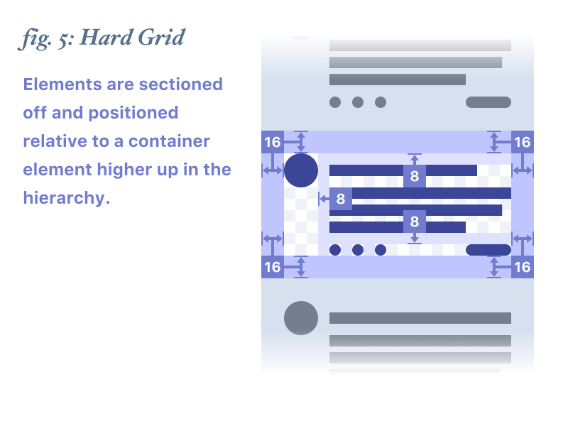
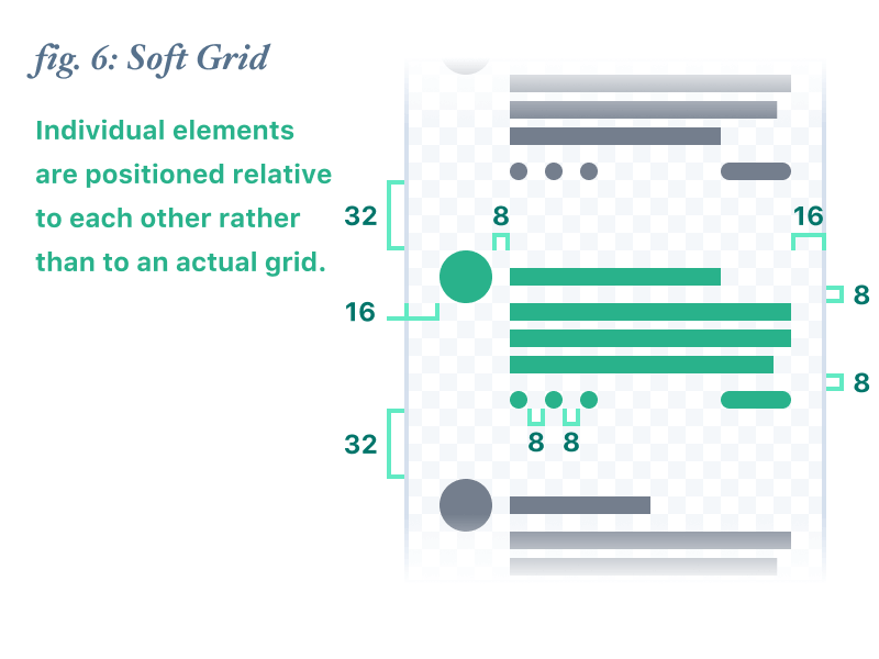
There are actually two prominent versions of this system. One that places elements into a system-displayed grid defined in 8-point increments (we’ll call this the “Hard Grid” method) and another that simply measures 8-point increments between individual elements (we’ll call this the “Soft Grid” method).
The primary argument for the Hard Grid method is that by using additional transparent background elements and then grouping them to small groups of foreground elements, you can keep track of margin and padding on a per-element basis and just snap these containers to the grid like bricks. Material Design - where everything is already designed to a 4pt grid - naturally conforms to this method.
The argument for the Soft Grid method is that when it comes time to code up an interface, using an actual grid is irrelevant because programming languages don’t use that kind of grid structure - it’ll just get thrown away. When the speed at which you arrive at a high-quality, programmable set of mockups is a priority, bypassing Hard Grid’s extra overhead of managing additional layers in favor of Soft Grid’s more fluid, minimal structure can be an advantage. This also can be more favorable to iOS where many system UI elements are not defined by an even grid.
Why it matters
Consistent UI
When all of your measurements follow the same rules, you automatically get a more consistent UI.
Fewer decisions = less time
By removing 7 of every 8 spacing options, you reduce the amount of fiddling available to you and subsequently reduce speed to code.
Multi-platform design
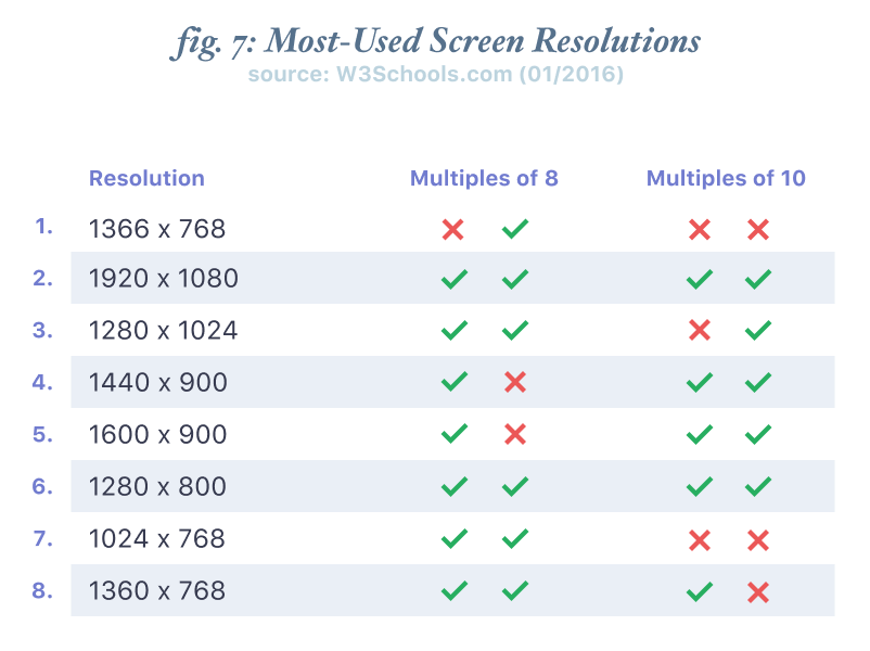
Regardless of form-factor, most popular screen sizes are divisible by 8 on at least one axis - usually both. Additionally, some platforms’ style guides (like Material Design) call specifically for a grid of 4 or 8 points, making this system a natural fit.
Some screens have apparently difficult sizes to adjust for (the iPhone 6 is 375 x 667 points), but the solution is actually quite simple. Keep your padding and margin dimensions consistent and reduce/increase the size of the block element to fill the remaining space. It’s OK to have an oddly-sized element if it keeps the grid consistent. Keep in mind that your users will likely never see the actual measurements you use.
Tips for implementation
Snap to grid
Almost every design app has a “Snap to Grid” option. If you’re using the Hard Grid method, it will definitely make your job easier. Regardless, you’ll want to make sure you have the “Snap to Pixel Grid” option enabled if one is available.
Rems and Variables
If you set your root text size to 16, you can easily use .5rem increments to build your layouts on an 8-point grid.
If you don’t want to do that, or don’t like rems, you can use a CSS or preprocessor spacing variable to handle layout while retaining the additional maintainability value that variables offer.
Define your grid
Most design apps allow you to adjust your “big nudge” value. I adjust mine in Sketch from 10 to 8, using an app called Nudg.it. It’s a very simple app that makes your whole workflow much faster and easier.
Shortcuts
Many apps have shortcuts to allow you to nudge, resize, and adjust increments on the fly. I highly recommend learning them - particularly nudges and size adjustments.
Recommended Reading
Keyboard Shortcuts for Sketch - sketchshortcuts.com
Frame your icons
Icons often need to be different sizes to maintain the same visual weight. Putting a frame around them, similar to how Hard Grid defines element sizes is a simple way to keep your measurements consistent, while allowing variation within defined parameters.
Zoom in, zoom out
If you spend all of your time zoomed to 1600%, you can misjudge your vertical rhythm. Conversely, if you’re always viewing your UI at 50%, you may miss important details, like pixel-fitting. Frequently adjust your zoom to make sure that you’re seeing the whole picture.
Copyright 2023 Spec Network, Inc.